

Business phone system
- Business phone systemA complete cloud phone system, set up for you
- Features50+ features: IVR, queues, recording, desktop and mobile apps
- Call flowsDecide exactly how every call is answered and routed
- AI Agents Built inAnswer, book and follow up on calls, day or night
- Time to upgradeStill on an old PBX? Here is what you are missing
Apps and hardware
- Desktop app Live demoCalls, chat, SMS and AI summaries in one window
- Mobile app Live demoYour business number on your iPhone or Android
- Uniden desk phonesThe EVOC2 and a full range of office, DECT and conference phones
- Business NBNNBN set up alongside your phones, on one bill
- Why our internetBuilt for voice, so calls stay clear when the line is busy
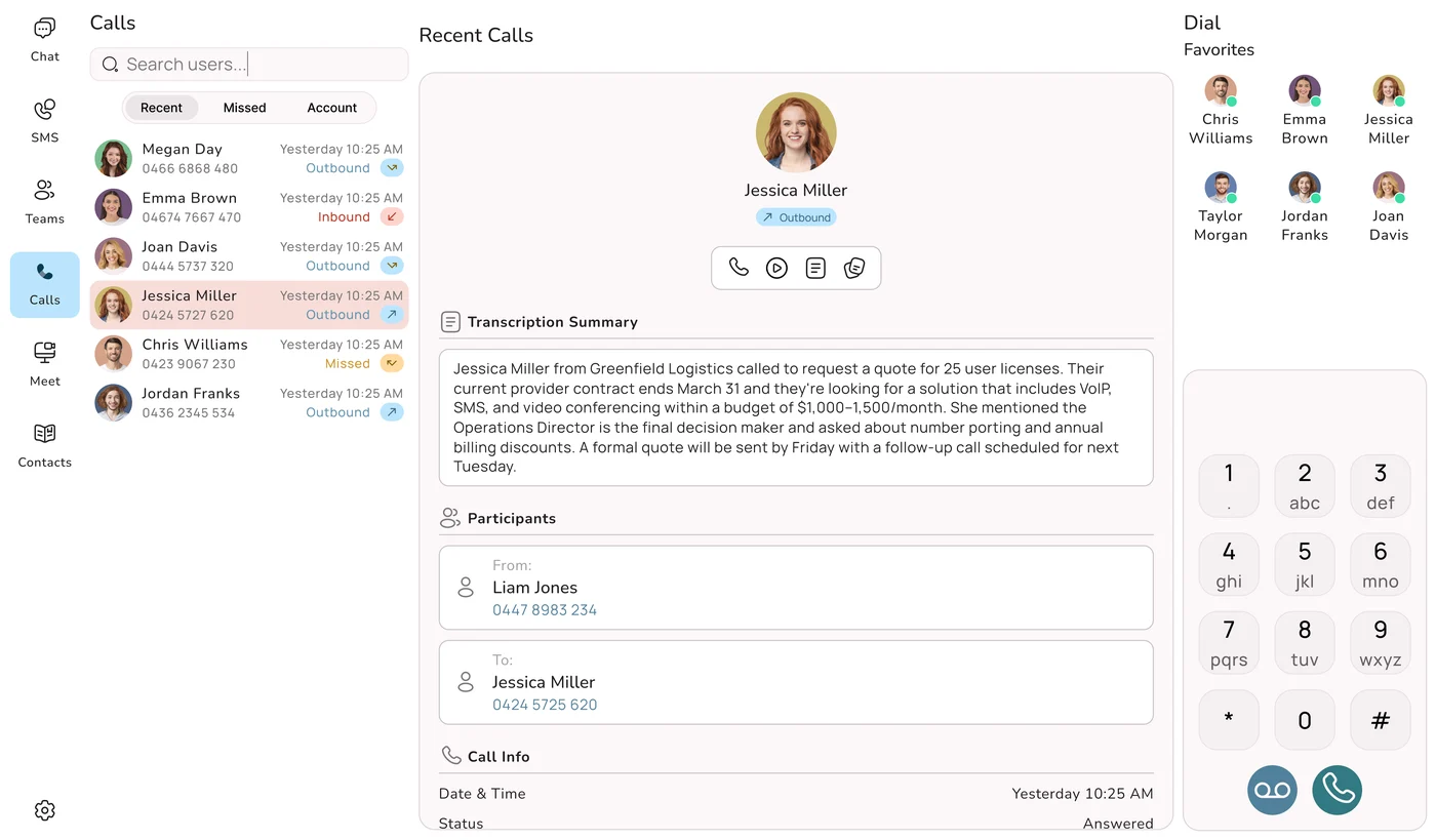
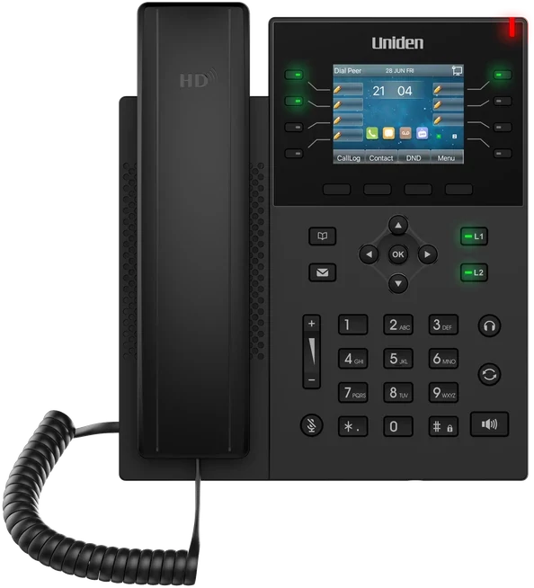
New Try it liveTake the Uniden Voice apps for a spin, right here
Click through working demos of the desktop and mobile apps: calls with AI summaries, team chat, SMS and more. No download, no sign up.
Desktop app demoMobile app demoDesigned, built, hosted and supported in Australia. Uniden desk phones, cloud apps and AI in one system.Book a demoAll features
AI on your phone line
Uniden Voice vs AI receptionists
See every comparisonAI AgentsEvery call answered, day or night
It answers on your own numbers, books the job, sends an SMS and warm transfers to your team when a person is needed.
Meet your AI agentBuilt into your phone system, not bolted on. No second number, no call forwarding.Book a demo
Professional services
Trades, retail and hospitality
Browse all industries Case study · Optical Solutions AustraliaFive branches, five phone systems, now one.5 sites1 systemRead the story
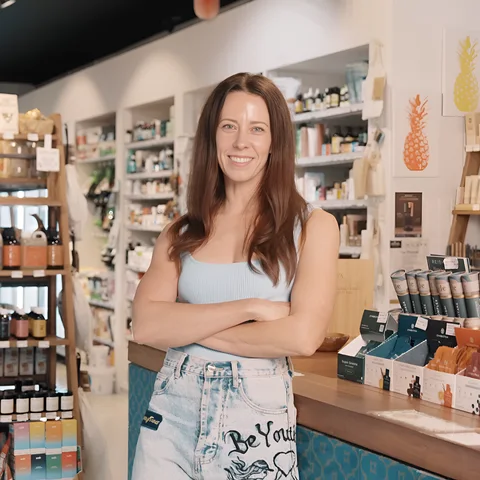 Case study · Coco's Wealth of HealthWhen every enquiry and phone order matters.Maroubra organic health-food storeRead the story
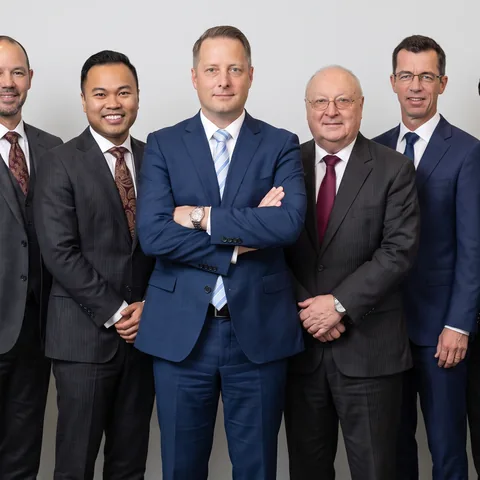 Case study · Shuriken ConsultingFour Sydney offices on one phone system.4 offices1 systemRead the story
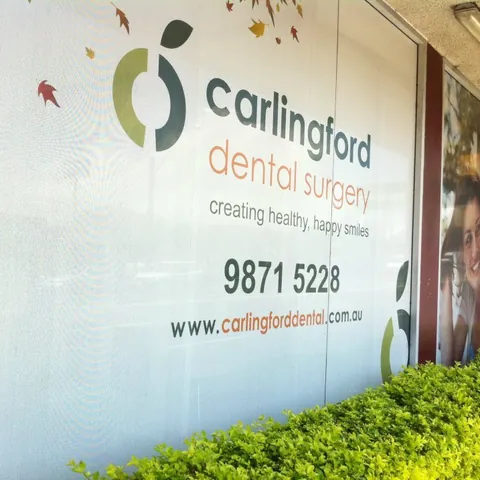 Case study · Carlingford Dental SurgeryEvery call rings the whole team.Dental Carlingford, NSWRead the story
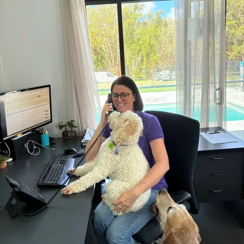 Case study · PTSD Dogs AustraliaA direct line for veterans, answered from anywhere.Charity Sunshine Coast, QLDRead the story
 Case study · Imperial Realtor GroupSales calls to sales, rentals to property management.Real estate Mango Hill, QLDRead the story
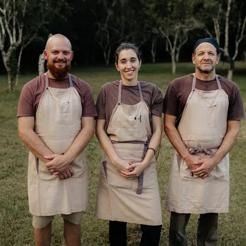 Case study · Good 2 Eat CateringA catering team on the move, on one number.Catering and events Sunshine Coast, QLDRead the story
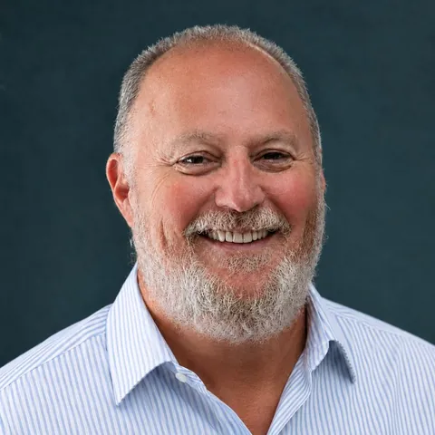 Case study · ManolutionsOne number for the firm, a direct line to Paul.Executive advisory Works across time zonesRead the story




Our customersFrom one-person shops to national brands
See how businesses like yours run their phones on Uniden Voice.
Find your industryWorking on your own? A real business number and NBN for sole traders, no lock-in.Sole tradersStartups
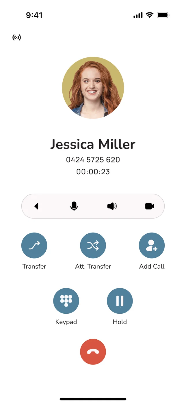
Phone plansBusiness phone planfrom$84.90/month3 users included on a 36-month term. Every feature, one simple per-user rate.Free setup and free number portingDesktop and mobile apps includedAI Agents built inSee phone plans![Uniden Voice mobile app on a call]()
![A small team working together at a desk]()
Internet, hardware and more

Bundle and savePhones and NBN from one Aussie team
One provider to call when something needs fixing. No finger pointing.
See NBN plansWe guarantee to beat any competitor's quote. Keep your existing numbers when you move across.Sign up online1300 881 662
Learn and get set up
The library at a glanceBrowse all
176business
guides398kreads
so far
guides398kreads
so far
Guides by topic
- Phone systems66
- AI24
- Industries18
- Costs12
- NBN8
- Security7
- News5
- Other guides36

Need a hand? Our support team is based in Australia.Contact support
Call us on 1300 881 662 or send a message and the team will get back to you.Send a message
Brand
Brand assets and guidelines
Logos, colour, type and the rules for using them. Please follow these guidelines whenever you show the Uniden Voice over Cloud brand.
Logos
46 files in the pack. Use SVG for anything digital or printed, and PNG only where a raster is required. SVG stays sharp at any size.
Primary lockup
The default. Use this everywhere unless you have a reason not to.


Reverse lockup
For dark backgrounds, photography and video.


Navy lockup
For brand-coloured panels where solid black reads as a hole.


Reverse on black
On black grounds and over dense photography.
Icon
The U on its own. Use it only where Uniden Voice is already named nearby.


Icon, reverse
The U on dark grounds.


App icons and tiles
For app stores, favicons, avatars and anywhere square.


Space and size
Two rules cover most of it. Give the logo room, and do not run it smaller than it can survive.
Clear space: The cap height of the U, on all four sides. That is 66% of the full lockup's height. Nothing comes inside it.
Minimum sizes
- Full lockup32 px tall
- Icon alone16 px
- App tile or favicon16 px
Below 32 px, do not shrink the lockup
VOICE OVER CLOUD is a hairline at about a fifth of the cap height of Uniden, and it turns to mush around 24 px. Under 32 px use the U with “Voice over Cloud” set beside it as live type, rather than shrinking the lockup.
Colour
Click any swatch to copy its hex.
Cyan is a dark-ground colour
#00b4d8 on white measures 2.46:1, which fails accessibility for text at any
size. On light grounds use VOC Teal #0a6e8a (5.82:1) instead. Cyan belongs
on navy and black, where it measures 4.73:1.
Typography
Plus Jakarta Sans
Headings and display. Set tight, with generous space around it.
Logotype
Supplied as outlines
The logo is artwork, not type. You never need a font to use it, and it is never re-set.
Headings
Plus Jakarta Sans, 700 and 800
Used across unidenvoice.com.
Body and UI
Inter, 400 to 600
Do and do not
The short version: use the files as supplied, give them room, and do not redraw anything.
Please do
Give it room
Keep the clear space clear on all four sides.
Use the supplied files
Always start from the artwork in the pack, never a screenshot.
Keep it legible
Respect the minimum sizes. If in doubt, go bigger.
Pick the right ground
Reverse on dark, primary on light. Check the contrast.
Please do not
Do not stretch or squash
Scale it proportionally, always.
Do not recolour it
Use the supplied colourways only.
Do not rotate or tilt
The logo sits level.
Do not add effects
No shadows, glows, bevels, gradients or outlines.
Buy now
Do not crowd it
Nothing inside the clear space.
Uniden
Do not rebuild it
Never re-type the name or redraw the mark.
Do not remove the ®
It is part of the supplied artwork. If it is too small to read, the logo is too small. Go up a size or switch asset.